


Thrice Album Cover Redesign
Amelie Meinel


Vheissu
By Thrice
Released on 5/10/2005
Recorded by Island Studios
11 Tracks + 2 Bonus Tracks
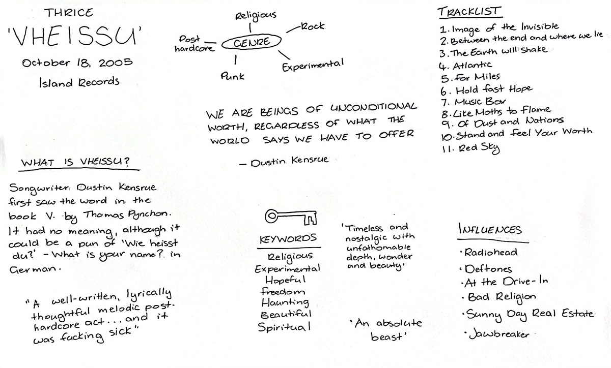
Genre: religious, experimental, post-hardcore, rock
Theme: optimism and hope despite continuous darkness
What's In A Name?
Guitarist and songwriter Dustin Kensrue said that he chose the name 'Vheissu' because it had no definitive meaning. It wasn't a loaded word, and so could simply serve as a representation of the songs in the album. I took this into consideration when redesigning the album cover, aiming to create something that reflected the Christian message of the album, while remaining subtle enough that it didn't push people away.
The Process
Research
Before I began the ideation of concepts for the album cover, I listened to and researched the album in order to understand the style and theme of the album. The overarching message of the album is the indescribable hope and optimism that is found in God, despite the darkness and hopelessness of the world.
Thumbnails
To begin generating ideas for the album cover, I used the 'crazy eights' method, in which I gave myself 8 minutes to sketch 8 different thumbnails. This method forced me to sketch out any idea I could think of, allowing my imagination to flow freely and create a number of different and interesting designs. I used a combination of these ideas in my final cover art.

From the thumbnails I was able to create more refined iterations of the album cover. Feedback from my classmates informed me that one of my iterations was an already existing album cover, however I was able to change the idea while still keeping the minimalistic style of the cover.
Iteration One
'Unseen Love'
The main purpose of this iteration was to play into the idea of seeking God - finding hope in a dark world. The large number of eyes help to show the difficulties in seeking God, and how overwhelming and distracting the world can be; interfering with the search.
The eyes were hand drawn using Chromacryl Waterproof Drawing Ink. The hand drawings help to add a sense of authenticity to the cover. The eyes themselves were inspired by the Aspen trees, which have 'eye-like' patterns in their bark.


Iteration Two
'Shadow of the Real'
This design is an ink drawing of an angel according to the Bible. It represents the otherworldliness of God and how in all our searching, we will never find all the answers. There will always be something we don't understand, and that's okay.
The angel was also drawn using the Chromacryl drawing ink, as I wanted to have a minimalist colour theme, and still wanted the cover to have a handmade effect. The finer details in the angel's wings were drawn using a 0.5mm artline pen.


Iteration Three
'No Greater Love'
This design is a reflection of the albums message of hope - representing the nails used in the crucifixion of Jesus, only for Him to rise to life three days later, forever defeating death. I kept the design simple, as I wanted the nail to be the hero of the cover, and I decided that having any additional elements would be too distracting.
The cover was created using Photoshop. I had taken a picture of a nail I found in my Dad's shed, and used the object select tool in photoshop to select the nail and remove it from the background. I then placed the nail on a plain white background, and added the album name to the bottom right corner. The font used was deliberately chosen, the serif typography creating a sense of professionalism and elegance.
I experimented with two different types of nails, but ultimately decided that the nail with the larger head was best, simply because it was more identifiable as a nail, especially when looking at it from a distance.


Final Album Cover
For the final cover, I decided to use and refine the third cover iteration. After discussion with a number of people, I decided to add the band name to the cover, in a slightly smaller and lighter-coloured font. When people go shopping for CD's or Vinyl, they tend to look for the bands they know. As the cover did not immediately make known who the band was, adding the band name was the best way do to this without taking away from the simplicity of the design.
Further discussion with my peers and tutor revealed to me that having a pure white background can be quite overwhelming and 'in your face', so I altered the background colour slightly, making it an off-white colour. Overall, this change in colour gives the album cover a more warm and inviting feel.
After even further discussion with multiple tutors, the typography of the album cover was changed to a handwritten font. This creates a greater sense of cohesiveness in the design, connecting the front cover to the back cover and the poster, where before it was disconnected from them, as the font on the front cover did not match the other designs.


The album cover was finished, but I wanted to add something that made it really unique, relating back to the themes of the album, but still keeping the minimalistic style I had chosen.
The album opens with a song called 'Image of the Invisible'. The song name and lyrics play into the belief that humanity was created in the image of the invisible God, and sets the precedent for the rest of the album.
Inspired by the song title, I printed out the album cover. Using 'invisible markers' I then went and wrote at least one lyric from every song on the cover. This was a really fun way to play on the song title, and add a bit of chaos to the cover without taking away from the design.


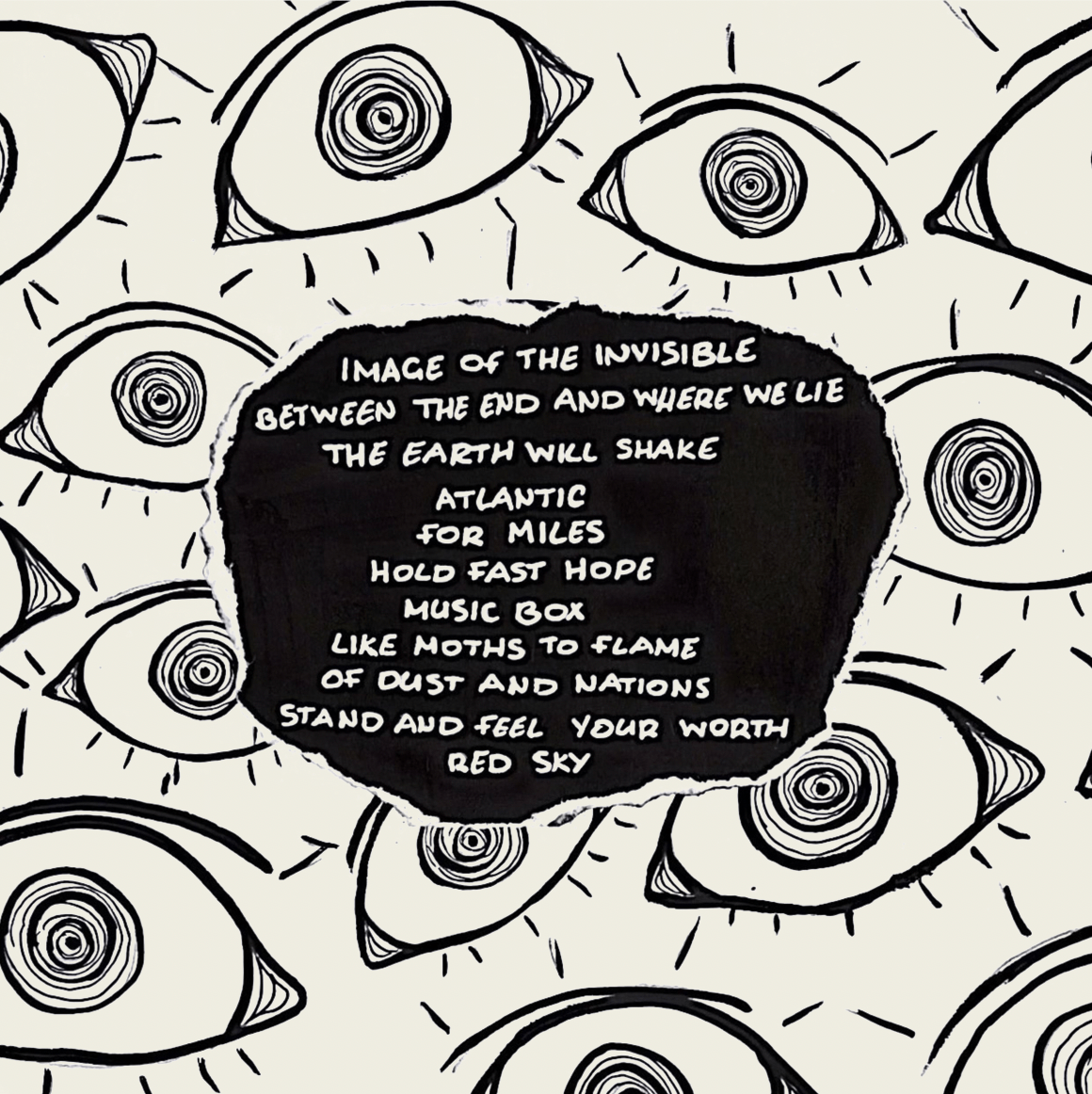
Back Cover
I wanted the back cover to have the same black and white colour scheme as the front, in order to main a sense of continuity in the design. However, because the front cover is so simple and minimalistic, I wanted the back cover to be the opposite, representing the overwhelming chaos and darkness of the world.
With that in mind, I decided to use my first iteration for the front cover. The eyes perfectly illustrated the point I wanted to make and created this feeling of chaos that I was aiming for.
When creating the tracklist to add to the back cover, I used the same ink that was used to draw the eyes, and created a plain black background. I then wrote the songs using a white 0.7mm Posca Pen.
I then ripped out the tracklist and glued it in the centre of the eyes to create a textured and handmade effect.


Because the eyes were drawn on white paper, the back cover did not match the front when I decided to make the background an off-white rather than pure white.
To fix this, I put the image into Photoshop and changed the background by using a combination of the colour range and masking tools, selecting the white background and masking it out to make way for the off-white background colour.


Centre Label
I ended up using a picture of one of the eyes for the centre label, to create a sense of continuity and connect the record with the cover. I did experiment with the centre label being hand-written lyrics of some of the song in the album, but in the end decided that the eye was the best option.


Promotional Poster

Poster Mockup

Reflection
'Vheissu' by Thrice explores the theme of finding hope in a hopeless world. It uses lots of Christian imagery, and draws inspiration from the works of C.S. Lewis, most notably 'The Silver Chair'. The songs follow a haunting journey of hopelessness and desperation, bringing into question the morality of the world, acknowledging that it's a broken place in need of saving. The final song, 'Red Sky', ends the album on a message of hope, while doubling as an encouragement for the listener to consider the state of their soul.
The redesigned cover art for 'Vheissu' captures the Christian message of the album, and the hope that is found in Jesus. The original cover art has taken the opposite approach, choosing to reflect the chaotic and overwhelming nature of the world. Both are strong designs, and I really enjoyed the process and problem solving used to create the design. While very different from the original cover, I believe my redesign is an eye-catching and interesting piece that does well to reflect the albums message of hope
Original Art: Redesigned Art:


References
1. rawpixel. (n.d.). Freepik. Retrieved from https://www.freepik.com/free-psd/retro-black-vinyl-cover-mockup-design_14413008.htm#query=vinyl%20cover%20mockup&position=4&from_view=search&track=sph
2. Freepik. (n.d.). Retrieved from https://www.freepik.com/free-psd/music-vinyl-mock-up_8870543.htm#query=record%20mockup&position=45&from_view=keyword
3. Bohmer, D. (2021, October 9). A Scene in Retrospect: Thrice - “Vheissu”. Retrieved from https://everythingisnoise.net/features/a-scene-in-retrospect-thrice-vheissu/
4. Bautts, J. (2006, April 5). Inside the Theology of Thrice’s “Vheissu”. Retrieved from https://bautts.me/2006/04/05/inside-the-theology-of-thrices-vheissu/
5. David, M. (2006, February 2). Thrice - Vheissu: No, it’s not some Hindu thing. That’s “Vishnu”, silly. Retrieved from https://murlough23.wordpress.com/2006/02/06/thrice-vheissu-no-its-not-some-hindu-thing-thats-vishnu-silly/
6. Thrice - Vheissu. (n.d.). Retrieved from https://genius.com/albums/Thrice/Vheissu
7. Vectonauta. (n.d.). Freepik. Retrieved from https://www.freepik.com/free-psd/mockup-crumpled-poster-old-grunge-wall_23739650.htm#page=4&query=poster%20mockup&position=19&from_view=search&track=sph
8. Thrice. (2020, March 7). Thrice - Image of the Invisible (Live Video from the Vheissu 15th Anniversary Tour). Retrieved from https://www.youtube.com/watch?v=rTrnMMuAytg


